I have a problem.
I can't just go to a store and buy something for a gift without adding to it, or making it into something different, or embellishing it...... Sometimes I think it would just be easier to go buy a gift and be done. But....I can't. I just love to personalize things or make things special for someone.
I have a glass etching project to show you today. Keep reading to find out how easy it is!
I needed a gift and wanted to use a monogram. I found a cake stand that I loved while browsing through Belk department store. I immediately knew it would be perfect for personalizing! I have a cake stand similar to it that I received as a wedding gift, from a very talented Aunt who happens to be an artist. Lucky Me!!!!! I use it often and hope the couple I give this to will too!
OK, back to the glass etching. The first glass etching project I did was a mirror that I did in art class when I was in junior high. I still have it hanging in my house after having it professionally framed. All you need for glass etching is some cream and a brush. To make your shapes you can free hand, trace objects or use a cutting machine. I used my Cricut for this project. I also used vinyl because that is what I had, but I have used contact paper from the dollar store before too.
This is the cream I used and it works exactly as it says on the directions. You don't need much for projects like this. I bought mine at Michael's. And guess what........I used a 40% off coupon!
Luckily for me the initial I used was an "H" which can look the same from right side up, or upside down. This was important because the lid for the cake stand can flip over to be used for a punch bowl. I also used a leaf pattern around the H that would look the same from either direction.
After cutting out the H on my Cricut, with the help of my handy helper (a 3 year old who can push the correct buttons) I put it on the glass making sure it was centered correctly. I used a little scraper tool to really make sure all the edges were stuck to the glass and there were no gaps. I should also mention that I cleaned and dried the glass first. Once it was all set, I liberally applied the etching cream with a brush and let it sit for 15 minutes, which was the recommended time on the directions. I used my timer so that all my images would look the same after having the cream on for the same amount of time.
When time was up I rinsed the cream off, pulled off the vinyl and rinsed the glass again. Next I applied the leaf image to one side, again being very careful to get all the edges down. I repeated the same process with both sides.
I decided to add a little image to the handle at the top. This took 2 steps too, and I used the same process again, using a design that I cut out on the Cricut and using the leaf pattern again.
I LOVE the way it turned out! Now I want to bake a cake or some goodies to put on mine!
What has been your experience with etching cream? What are your favorite projects using etching?
Linking up with: The Girl Creative, My Romantic Home, Chic on a shoestring Decorating, The Shabby Nest, Redoux, Serenity Now
Green Willow Pond
Friday, May 31, 2013
Thursday, May 23, 2013
New Baby Tag Art
Hello Everyone! Today I want to share a really simple and special gift for a new baby. There is a special new baby that I wanted to make a special gift for, including all the really important facts of his BIRTHday! I had a little sneak picture a few days ago on Twitter, now here is the whole thing.
Keep scrolling if you want to see the individual tags up close. I can not take credit for this really cute idea. It came from a book. I have lots of craft books and use them regularly. I love the ideas in this book, and there are sources listed as well as templates.
Here is the picture in the book of the tag art. Mine is a little different, of course. I used what I had and my canvas was not the same size, so I changed it to fit my size canvas. Also, I used paper that I had in myout of control large stash.
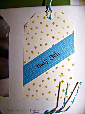
This one was a blank cardstock that I stamped with the star stamper in green. I use 2 sided tape to hold most items together. All the tags I eyeballed for size and then cut all the same on a paper cutter. I reinforced the hole (on the back) before using the twine.
The photo tag was printed out from my computer. Obviously my printer needs some help, but I don't think it is as bad in person as it looks in the pictures.....Isn't he a cutie though!!!
I love the ridges on the paper I used for this tag. The L was cut out by hand after tracing the letter onto the paper. I had printed it out in a font I liked and transferred it to the paper. I used an ink pad to get the edges of the square paper colored for a more layered look.
I bought a new tape measure in the sewing department of a store. I cut it and folded it and glued it. I used twine to mark the babies length at birth, gluing it in back.
This might be my favorite tag. I love the look of this one. I printed out the letters and transferred them to the paper and then went over it with a black marker.
For the time tag, I printed out an image of a blank faced clock and used a marker to put the birth time on it.
I cut a few extra tags in plain cardstock and hole punched them. I included extra twine also. This is in case the baby's momma wants to add a footprint. I put the stamp of the cute little giraffe there thinking that would be a good spot to remove the giraffe and put a footprint tag instead.
I checked Amazon and they have the book B is for Baby and it is on sale!!! You know I love a bargain and especially if you have amazon prime (no shipping) this is a deal. This is not an affiliate link, I just put it there for your convenience and because it is a great book for ideas.
Hope you liked this little artwork for a new special baby boy!!!
Have a great day!!!
Linking Up With: House of Hepworths, Beyond the Picket Fence
Keep scrolling if you want to see the individual tags up close. I can not take credit for this really cute idea. It came from a book. I have lots of craft books and use them regularly. I love the ideas in this book, and there are sources listed as well as templates.
Here is the picture in the book of the tag art. Mine is a little different, of course. I used what I had and my canvas was not the same size, so I changed it to fit my size canvas. Also, I used paper that I had in my
This one was a blank cardstock that I stamped with the star stamper in green. I use 2 sided tape to hold most items together. All the tags I eyeballed for size and then cut all the same on a paper cutter. I reinforced the hole (on the back) before using the twine.
The photo tag was printed out from my computer. Obviously my printer needs some help, but I don't think it is as bad in person as it looks in the pictures.....Isn't he a cutie though!!!
I love the ridges on the paper I used for this tag. The L was cut out by hand after tracing the letter onto the paper. I had printed it out in a font I liked and transferred it to the paper. I used an ink pad to get the edges of the square paper colored for a more layered look.
I bought a new tape measure in the sewing department of a store. I cut it and folded it and glued it. I used twine to mark the babies length at birth, gluing it in back.
This might be my favorite tag. I love the look of this one. I printed out the letters and transferred them to the paper and then went over it with a black marker.
For the time tag, I printed out an image of a blank faced clock and used a marker to put the birth time on it.
I cut a few extra tags in plain cardstock and hole punched them. I included extra twine also. This is in case the baby's momma wants to add a footprint. I put the stamp of the cute little giraffe there thinking that would be a good spot to remove the giraffe and put a footprint tag instead.
I checked Amazon and they have the book B is for Baby and it is on sale!!! You know I love a bargain and especially if you have amazon prime (no shipping) this is a deal. This is not an affiliate link, I just put it there for your convenience and because it is a great book for ideas.
Hope you liked this little artwork for a new special baby boy!!!
Have a great day!!!
Linking Up With: House of Hepworths, Beyond the Picket Fence
Saturday, May 18, 2013
It's Blueberry Season!!!!
I LOVE BLUEBERRIES!!! Some fruits I associate with summer time and blueberries is one of those. Back home, the blueberries arrive later in the season, but here in the south they are early and I love it!
Yesterday after school, I brought the boys to an organic blueberry farm about a 40 minute drive away. They had a great time searching for ripe blueberries. We each had our own bucket and went down many rows to get as many as we could. After 30 minutes they were done so we went to weigh our crop. In total we picked 4.4 lbs and spent WAY less than we would at the grocery store at $2.59 per lb. My bucket is not shown in the photo below :-)
There was row after row of blueberries and lots of varities. The picture below shows the 2 varities we picked. Other varities were not ready yet so we will be going back in about 3 weeks for more!
Last night after we got home, I made a blueberry cobbler that was delish! We all ate it right up, nice and warm out of the oven.
I made blueberry waffles this morning and they were so yummy too. I will most likely freeze some to use in smoothies. I saw on Pinterest an interesting idea for blueberry lemonade. We also love to eat them plain. Usually on a toothpick, the boys like to see how many they can get onto one toothpick!
What is your favorite blueberry recipe?
Saturday, May 11, 2013
Boys Room Reveal
Hope you are having a good weekend.
I thought I would share the boys' entire room. I have shown lots of posts of projects but have not shown the entire space yet. The headboards that I built from Ana White plans, the painted dresser, the pennant banner are all posts. You can read all the details by clicking on the links.
When you stand in the doorway and look to the right this is the view.
If you look slightly to the left you can see both beds with a cube system that I turned on its side to fit between the beds. This works out great because it is not deep and I don't have to worry about a big nightstand sticking out with my little one. I was picturing bumped heads in the middle of the night....probably would never have happened but I feel better about it!!
The one window valance was made by me. I used a brown fabric with some extra fabric with stars on it and little brown ball trim. I lined it and hung it high. So sorry about the light from the window. There is such contrast in the dark fabric and the light that I could not get a better picture. I am sure if I had a clue about cameras, I could, but that has not happened yet....
This little desk is the perfect size. I found it at the Habitat for Humanity ReStore when they had their annual yardsale. It was $20. It was an orangey, yellow color so of course I painted it the same color as the headboards. The little stool you see is temporary. The desk chair broke and until I find a new chair or stool this little one sits there.
There was a tiny wall space between the closet door and the wall so I made these holders for hats. I used scrap wood and bought a bag of wooden pegs and made these. They fit perfectly in this little spot.
Here is the wall with the pennant banner on it.
This is looking at the door to their room. You can see I have another peg rack at their height so I don't have to hang things up...... it may or may not work!
I had fun changing their room when I put my younger son into the same room as my older son. I wanted to make it different than what it was so it was their NEW room together.
Sources:
Star Comforters: Pottery Barn Kids
Headboards: Built by me from Ana White plans
Wall Color: Cumulus Cloud by Benjamin Moore
Valance: Made by me from fabric I had. The pom pom fringe was from Hobby Lobby
Headboard/Desk Color: Black Abyss by Clark & Kensington
I want to remind everyone that there is ONE DAY LEFT to enter the giveaway for a really cool enamel house number sign from Ramsign. See my giveaway post for details.
Here is a picture of a sign.
Linking up with:
Funky Junk Interiors
It's Overflowing
A Little Claireification
Thrifty Decor Chick
Wednesday, May 8, 2013
Mini Celebration and a Giveaway
I am so happy to announce that I have an awesome giveaway for you today to celebrate my baby 3 month blogiversary! I am so excited about this giveaway because who wouldn't want to add a little personality and curb appeal to their home? Especially when Spring is here and we are all excitedly sprucing up our porches, patios, entryways and more. Here are a few images of the giveaway. They are enamel house signs from a company called Ramsign. Make sure you visit their website to see more pretty pictures.
Aren't they beautiful? One lucky winner will pick out any house number sign with 1-5 digits in any of their 5 design styles to be custom made. Sorry, no name signs or address plaques for this giveaway (they are lovely too aren't they?). This giveaway is open to any readers, including international readers!!!
Are you interested?
Here are the rules:
This giveaway is open now through Mother's Day, May 12th 2013 at Midnight EST.
You are allowed THREE entries. Here is what you do for each entry.
#1. Subscribe to follow my blog by email and leave a comment (on this post) telling me that. Make sure your email is included in your profile or type your email using "at" and "dot" so I can notify you if you win! For example "thriftysouthernpilgrim at gmail dot com"
#2. Go to the Ramsign Website and leave me another comment here telling me which sign you would choose, should you win. Remember you can choose house number plaques from the 5 design styles with 1-5 digits.
#3. Follow me on Twitter @thriftyspilgrim and leave me another comment here telling me that you did that.
I'll share something with you. My lucky number is 13 - I am a Friday the Thirteenth baby and proud of it! So, I really like this little cottage with the red number 13 on it!
You can visit the Ramsign Facebook Page for more information and go ahead and Like them while you are there!
Good Luck, thanks for visiting and come back soon!!!
Sunday, May 5, 2013
Furniture Rearranging
Chronic Furniture Rearranging. Does anyone else have this problem? It is like an itch that I just have to scratch! Hubby is so used to coming home to things in different places that all he does is roll his eyes - or say "wow this looks great", and that is it!
I was tired of my living room arrangement. My living room is wide and has french doors to the patio on one of the long sides, it is open to the kitchen on the other side so that only leaves two walls. The cable outlet is in a fixed location so the TV has to stay in that general area.
My goals for a new furniture arrangement were:
1. Not to lose any seating
2. Hopefully gain a seat
3. Keep the TV where it is. I have moved the big entertainment unit but like it best in the corner
4. Get the seating closer, to facilitate conversation
5. Buy nothing (he, he)
On a side note - a positive thing about furniture rearranging is CLEANING. I move furniture to vacuum, but moving it to another area completely lets you really see what was hiding in the far corner under the couch!!
Here is what it looked like before, or you can view it in Our Home.
See, the couch and 1 chair were a mile away from the other chair and TV.
Okay, keep in mind my goals above....... I moved the couch so that the back is when you walk in. I usually don't like this, but it lets me have a more conversation-oriented layout. I don't need the big open space on the rug I had before that I used when the kids were little. With my new layout the couch is in front of the french doors and I LOVE to sit on the couch in the evening, with the french doors open, and listen to the sounds!
Here is a view of the side wall as you walk into the family room. Did not change much except for the chair.
This is from across the room.
Here is a closeup of the wonderful OLD window frame that is from Quincy MA when I lived there. Someone was throwing it out...... I had blue glass put in it but then when I changed my decor and did not use blue anymore I just took it out and have never replaced it. I love the rusted original window lock.
This view is from standing in the patio doors looking in the house.
Here is a real life photo of where I keep toys.....and where my shirtless kids are. I got rid of most the toys in this room when we changed the boys to one room, therefore gaining a playroom. However, one little basket remains. I keep it hidden here.
This is my "new" chair. My mother in law's friend was downsizing and I got it for a wicked steal (there's some Boston lingo for y'all!). Anyways, it has a beautiful shape and the cushions are made of down. It is a very comfortable chair. I don't care for the fabric, but at least it does not clash with my decor. I am waiting until I decide what I want to reupholster this with before I tackle this beast. It will be a LOT of work. There is piping, double piping, an ottoman. I will, of course, blog about my foils when I do tackle this project.
This little alcove area is by our master bedroom door. It is angled, but is to the left (or behind) the chair with the toy basket. I painted the back with a trellis pattern with sparkle paint and layered the mirror and frame here. This is another old thrift store frame with cool linen in it, like my chalkboard frame, but I painted this linen black along with the frame.
This view is standing with your back to the alcove and frames you just saw.
Have you done any rearranging in your home, or do it at all? Ilike love thrive on change sometimes!
Thanks for visiting!!!!
I'm sharing with:
I was tired of my living room arrangement. My living room is wide and has french doors to the patio on one of the long sides, it is open to the kitchen on the other side so that only leaves two walls. The cable outlet is in a fixed location so the TV has to stay in that general area.
My goals for a new furniture arrangement were:
1. Not to lose any seating
2. Hopefully gain a seat
3. Keep the TV where it is. I have moved the big entertainment unit but like it best in the corner
4. Get the seating closer, to facilitate conversation
5. Buy nothing (he, he)
On a side note - a positive thing about furniture rearranging is CLEANING. I move furniture to vacuum, but moving it to another area completely lets you really see what was hiding in the far corner under the couch!!
Here is what it looked like before, or you can view it in Our Home.
See, the couch and 1 chair were a mile away from the other chair and TV.
Okay, keep in mind my goals above....... I moved the couch so that the back is when you walk in. I usually don't like this, but it lets me have a more conversation-oriented layout. I don't need the big open space on the rug I had before that I used when the kids were little. With my new layout the couch is in front of the french doors and I LOVE to sit on the couch in the evening, with the french doors open, and listen to the sounds!
Here is a view of the side wall as you walk into the family room. Did not change much except for the chair.
This is from across the room.
Here is a closeup of the wonderful OLD window frame that is from Quincy MA when I lived there. Someone was throwing it out...... I had blue glass put in it but then when I changed my decor and did not use blue anymore I just took it out and have never replaced it. I love the rusted original window lock.
This view is from standing in the patio doors looking in the house.
Here is a real life photo of where I keep toys.....and where my shirtless kids are. I got rid of most the toys in this room when we changed the boys to one room, therefore gaining a playroom. However, one little basket remains. I keep it hidden here.
This is my "new" chair. My mother in law's friend was downsizing and I got it for a wicked steal (there's some Boston lingo for y'all!). Anyways, it has a beautiful shape and the cushions are made of down. It is a very comfortable chair. I don't care for the fabric, but at least it does not clash with my decor. I am waiting until I decide what I want to reupholster this with before I tackle this beast. It will be a LOT of work. There is piping, double piping, an ottoman. I will, of course, blog about my foils when I do tackle this project.
This little alcove area is by our master bedroom door. It is angled, but is to the left (or behind) the chair with the toy basket. I painted the back with a trellis pattern with sparkle paint and layered the mirror and frame here. This is another old thrift store frame with cool linen in it, like my chalkboard frame, but I painted this linen black along with the frame.
This view is standing with your back to the alcove and frames you just saw.
Have you done any rearranging in your home, or do it at all? I
Thanks for visiting!!!!
I'm sharing with:
Subscribe to:
Posts (Atom)